How to change the state of button value as ‘follow/unfollow’ or ‘like/dislike’ through onclick handler method uses of ‘lightning-button-stateful’ tag elements in Salesforce LWC (Lightning Web Component) | How to change the state of lightning:buttonStateful label value as ‘like/dislike’ or ‘following/unfollowing’ use an onclick handler method in Lightning Web Component – LWC (Salesforce)

change stateful button value in lwc -- w3web.net

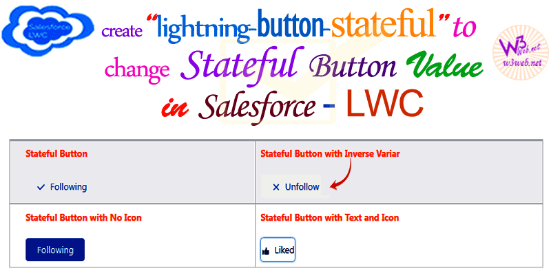
Hey guys, today in this post we are going to learn about How to change the state of button value as ‘follow/unfollow’ or ‘like/dislike’ through onclick handler method uses of ‘lightning-button-stateful’ tag elements in Salesforce LWC (Lightning Web Component). A lightning-button-stateful component represents a button that toggles between states, similar to a Like button on … Read more →

How to create lightning-card container with custom tab functionality uses a button in the actions slot where we are opening a lightning popup inside a custom form, displaying plain text in the footer slot in Salesforce LWC | How to apply lightning-card to create stylized container around a grouping of information to display different section like Header, Body, Footer and button actions with open a popup inside form in Salesforce LWC (Lightning Web Component)

create lightning-card container with custom tab in lwc -- w3web.net

Hey guys, today in this post we are going to learn about How to create lightning-card container with custom tab functionality uses a button in the actions slot where we are opening a lightning popup inside a custom form, displaying plain text in the footer slot in Salesforce LWC. A lightning-card is used to apply … Read more →

Create Button Menu with Custom dropdown with a list of actions/functions and display selected value when you click on list option uses of ‘lightning-button-menu’ tag element in Salesforce lightning web component – LWC | Set the value of ‘lightning-button-menu’ drop-down menu button and show/hide the content’s on-selected link of list option in Salesforce LWC – Lightning Web Component (Salesforce)

create button menu with custom dropdown in lwc -- w3web.net

Hey guys, today in this post we are going to learn about Create Button Menu with Custom dropdown with a list of actions/functions and display selected value when you click on list option uses of ‘lightning-button-menu’ tag element in Salesforce lightning web component – LWC. A lightning-button-menu component represents a button that displays a dropdown … Read more →

how to set/get required value of ‘Radio Group’ & ‘Radio Group Button Type’ and display selected value as enabled/disabled or selected/deselected horizontally uses of ‘lightning-checkbox-group’ tags in lightning web component – LWC Salesforce | How to change the lightning-radio-group selected value as checked/unchecked and set default selected radio button in Salesforce LWC (Lightning Web Component)

set slds-radio button horizontal in lwc -- w3web.net

Hey guys, today in this post we are going to learn about how to set/get required value of ‘Radio Group’ & ‘Radio Group Button Type’ and display selected value as enabled/disabled or selected/de-selected horizontally uses of ‘lightning-checkbox-group’ tags in lightning web component – LWC Salesforce. A lightning-radio-group component represents a group of radio buttons that … Read more →

How to pass checkbox value, marked required and marked enabled/disabled in Salesforce Lightning Web Component (LWC) | set value of checkbox with enabled/disabled and required uses of lightning-checkbox-group tags in lightning web component – LWC

set checkbox required disabled and enabled in LWC -- w3web.net

Hey guys, today in this post we are going to learn about How to pass checkbox value, marked required and marked enabled/disabled uses of lightning-checkbox-group tags in Salesforce Lightning Web Component (LWC) A lightning-checkbox-group component represents a checkbox group that enables selection of single or multiple options. If the required attribute is set, at least … Read more →

How to use the lightning-formatted-email, lightning-formatted-number, lightning-formatted-phone, lightning-formatted-date-time, lightning-formatted-text, lightning-formatted-address, lightning-formatted-url in Salesforce lightning web component (LWC) | how to display of lightning-formatted input fields and there values in Salesforce LWC (Lightning Web Component)

use the lightning formatted fields in lwc - w3web.net

Hey guys, today in this post we are going to learn about How to use the lightning-formatted-email, lightning-formatted-number, lightning-formatted-phone, lightning-formatted-date-time, lightning-formatted-text, lightning-formatted-address, lightning-formatted-url in Salesforce lightning web component (LWC). A lightning-formatted-text component displays a read-only representation of text, and can convert URLs and email addresses to links, or “linkify” them. Click more about lightning-formatted-text. A … Read more →

how to create online to-do task checklist in component template and buttons click functionality uses of lightning/flowSupport module in lightning web component LWC | create todo daily task list template application for work using lwc component in LWC

how to Create To-Do Task Checklist in Salesforce LWC -- w3web.net

Hey guys, today in this post we are going to learn about how to create online to-do task checklist uses of lwc component template and buttons click functionality in lightning web component LWC. The lightning/flowSupport module provides events that enable a component to control flow navigation and notify the flow of changes in attribute values. … Read more →

Create dynamic tree grid with expande / collapse selected rows and select checkbox for the entire row select/deselect in Salesforce lightning web component LWC | how to create tree grid with expanded/collapsed section for the entire row marked as select / deselect with checkbox in Salesforce LWC

tree grid dynamic expand collapse in lwc -- w3web.net

Hey guys, today in this post we are going to learn about How to Create dynamic tree grid with expanded/collapsed selected rows and select checkbox for the entire row select/deselect in Salesforce lightning web component LWC. A lightning-tree-grid component displays hierarchical data in a table. Its appearance resembles lightning-datatable since it implements lightning-datatable internally, with … Read more →

How to create custom progress indicator circular/ring or horizontal slider/range uses of lightning-slider and lightning-progress-ring elements in Salesforce lightning web component – lwc | create progress indicator bar circular/ring or horizontal slider/range in Salesforce LWC

custom circular indicator slider in lwc -- w3web.net

Hey guys, today in this post we are going to learn about How to create custom progress indicator circular/ring or horizontal slider range uses of lightning-slider and lightning-progress-ring elements in Salesforce lightning web component – lwc What is lightning progress ring? → A lightning-progress-ring component is a circular progress indicator. It shows a value from … Read more →

Create lightning platform show toast event/dispatchEvent where display toast message with hyperlink click button and navigate to external link in Salesforce lightning web component LWC | how to display toast message with hyperlink and navigate to external URL uses of ShowToastEvent / NavigationMixin in Salesforce LWC

show toast Message hyperlink in lwc -- w3web.net

Hey guys, today in this post we are going to learn about how to Create lightning platform show toast event/dispatchEvent where display toast message with hyperlink click button and navigate to external link in Salesforce lightning web component LWC To trigger a toast from a Lightning web component, in the component’s JavaScript class, import ShowToastEvent … Read more →